
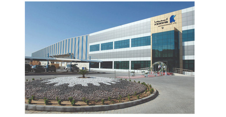
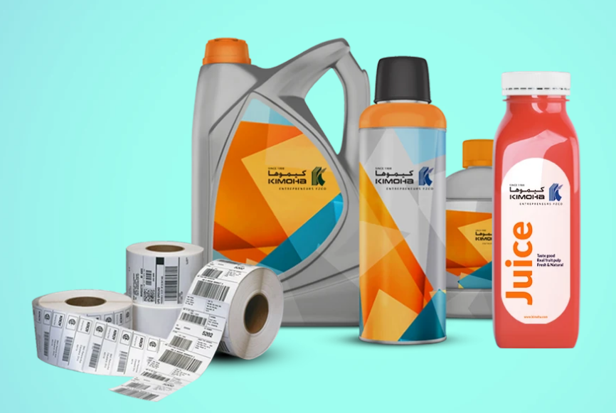
Dubai Based Kimoha Wins Finat Label Competition Award
The 2020 FINAT Label Awards Ceremony, for the first time ever, broadcasted live on Thursday, 26 November, 16.00 CET from the FINAT premises in The Hague, revealed the winners of the 2020 FINAT Label Competition. Dubai based Kimoha won an award for Innovation.
The competition held under the motto ‘casting out the net’ heading. The Best in Show award and the winner of the Non-Adhesive Group was outstanding in that it included the tactile effect of a fishing net which was produced by applying a clear tactile varnish over the printed image of the net giving a feeling of realism to this sleeve. The entry submitted by IPE Industria Gráfica SLU, Spain showed just how important very accurate registration is to the finished quality of the label. High quality flexo printing of both the fishes and the net made the design stand out amongst all the group winners. The tactile fishing net allows customers to experience the feel of the net whilst enjoying the white wine. The blue lighthouse adds further interest and also acts as an automatic bottle orientation device in the production process.
This year, FINAT received 264 entries from 44 companies representing 23 countries. In addition to the 39 Category and Group winners, 93 Highly Commended certificates were distributed. The top country for entries was France with 52 entries, Turkey was in second place with 35 and the USA with 26. The number of entries in each class was again led by Wines (59), Alcoholic Drinks (29), Cosmetics (27) and Sets of labels (21) closely followed by Self-Promotional labels. The number of entries in the Marketing Group which included digital technology was slightly lower (42%).
Group winners
The Winner in the Innovation Group was Kimoha Entrepreneurs FZCO, United Arab Emirates for Examination Label. A novel but simple concept designed to be used under examination conditions where the identity of the candidate is hidden from the marking examiner. The dense black layer prevents revealing the identity of the candidate until the final marking is completed. Printed using flexography in three colours this label has a very practical security application.
The group awards are organised as usual into the following five main groups which includes Marketing/ End-uses, Printing Processes, Non-Adhesive Applications, Innovation and Electronic Printing and Digital Printing.
The winner in the Marketing/-Uses Group was Germark S.A., Spain for 1580 Cap Andritxol Cabernet Sauvignon. A fine example of the combination of four colour digital printing with a silk screen varnish giving an embossed effect to the label. The use of a rough textured paper added to the depth of the label and an illustration of a historical building gave the label a feeling of longevity.
The winner in the Printing Processes Group was Çiftsan Label and Packaging Company, Turkey for Doxa Life Men Shampoo. A lot going on in this five colour label. Matt black lamination contrasted nicely with the silver hot foil hologram branding. A partial screen lacquer gave a nice tactile effect in the lower half of the label. Well printed with several techniques crammed into one label.
The winner in the Digital Printing Group was Etiketten CARINI GmbH, Austria for Amstutz Apfel Edelbrand. A deceptively simple label with high visual impact. Printed using digital technology in four colours with sculpted hot foil on the apple and varnish on the lettering gave an embossed effect which added to the attractiveness of the label. The use of a textured paper substrate gave added depth to the background of the label.
This year, the Judges Award for technical merit was given to Multi-Color Corporation Bingen, Germany for Kyburg Riesling Trocken. The reason this attracted the judge’s attention is the fact that no ink was used in its production, only hot foiling and embossing. The label is made in three steps, the illustration was foiled in gold with nanostructure effects, black foil is used with prism embossing for the castle and lettering, and a transparent foil is used to emboss the shield and sun. Impressive indeed.

Judges’ Comments on the Category Winners
Group A Marketing/End-Uses
A1 Wines
Joint Winners
Germark S.A., Spain for 1580 – Cap Andritxol Cabernet Sauvignon
Great use is made of digital printing in four colours, the silk screen varnish gives a tactile, embossed effect which enhances the central image of the historical tower. The use of a rough textured paper adds an interesting background to the central image.
Marzek Etiketten+Packaging GmbH, Austria for Karl Karigl & the Wonderful Wine Gypsies
A truly golden label imaged using gold hot foiling. The quality of detail in this one colour label is truly outstanding. Fine detail in the type is complemented by the detailed structuring in the fingers. The use of a slightly roughened paper substrate adds to the final appearance of the label. Overall a very nice result making the best use of the hot foiling process.
Multi-Color Corporation Australia for Where Eagles Dare Shiraz 2019
An interesting label which has a story to tell. A relatively high altitude vineyard which is home to eagles, bees and serpents, the diversity of the countryside is depicted in this label. Digitally printed in five colours using high gloss varnish to highlight the eagles, silver hot foil for the beehive and the ethereal image hovering over the countryside. The use of an uncoated stock highlights the spot varnished areas and the use of a matt varnish completes the final effect.
A2 Alcoholic Drinks
Joint Winners
Multi-Color Corporation Australia for Jaisalmer Indian Craft Gin
A dramatic looking label printed using offset litho in five colours on a metal faced substrate. A matt varnish is used to give a deep black background, a spot flexo gloss varnish for the main gold and blue type and the coat of arms. Sculptured embossing gives the images depth and a 200 lpi halftone screen image was used to relieve the background.
Multi-Color Italia S.p.A., Italy for The Wild Geese Soldiers and Heroes Rare Irish Whiskey Untamed
A label with a message for past military action! Printed on a dull silver coated paper using flexo and screen printing in 6 colours with silver cold foiling and silk screen black lettering focusses the eye on the central image of the heart and sword. The silver foil frames the label nicely giving it a touch of class.
A3 Non-Alcoholic Drinks
Achertäler Druckerei GmbH & Co. KG, Germany for Humboldt Freigeist Alkoholfrei
This label was created to replicate a 18th/19thy century painting of Humboldt. Printed using offset litho in four colours and an 80 lpcm halftone screen with the green hot foil sun’s rays giving a 3D impression adding depth to the “old fashioned” design. The well printed halftone type faces are very clear and legible. The label contains a lot of information about the product and the person.
A4 Food Products
Joint Winners
Skanem Skurup AB, Sweden for Abba Skärgårdssill 220 g
Printed on a film substrate using flexo in seven colours and a 133 lpi halftone screen. This is a busy label for a fish product enforced by the illustration of the sea in the background. The coat of arms is very clear and well printed. The touch of the gold seal and the Kungshaman lettering in gold adds a touch of class.
Çiftsan Label and Packaging Company, Turkey for Olive Truck Extra Virgin Olive Oil
A nice clean looking label featuring the journey of the olive from picking through to the kitchen table. Digitally printed in 4 colours is only the start, excellent gold hot foiling adds a real touch of luxury and the use of silkscreen printing to effectively emboss the logo completes the label. The type is extremely clear and legible and the addition of Braille alphabet adds the final touch to a delightful label.
A6 Household Products
Stratus Packaging, France for Maison Berger Doré
An attention grabbing label printed in a single colour, white, using ink jet technology on a glossy PP gold substrate. Alternate rows are printed in halftone white to add variety to the images. The die-cutting is somewhat complicated using double cutting techniques to allow for easier handling during application. The background between the rows is printed with an opaque white to support the gold imaging.
A7 Industrial
Schreiner Group GmbH & CO KG, Germany for Color Laser Film Translucent
The function of this label is to enable a manufacturer to add variable data even when the label has been fixed to the product allowing late stage customisation using laser technology. Printed in two colours using flexo and lamination techniques. The data is inscribed using a laser which turns the inscription translucent.
A8 Automotive
Doga Etiket ve Ambalaj San. Tic. A.Ş., Turkey for Castrol Magnatec Stop-Start 5W-30
A space age illustration depicting oil circulating around a metal bearing immediately grabs the viewer’s attention. Printed digitally in 5 colours it is the use of a matt varnish background contrasting with the plentiful use of spot screen emboss varnish which adds extra interest to the label. An interesting well printed label.
A9 Cosmetics
Joint Winners
Stratus Packaging, France for 1902 Mille Fleurs Body Scrub
A very neat and tidy label printed using flexography, in six colours, to a very high standard on a PP white film substrate. The quality of the type is excellent, very sharp and legible. Over lamination protects the label when in use in the bathroom. Deserves a category award.
Çiftsan Label and Packaging Company, Turkey for EST Perfume Jewels Wild Beauty Body Splash
A delightfully visually complex label matched by the combination of several techniques which makes this label a category winner. Printed digitally on a transparent substrate in six colours the hot foil and matt lamination creates a rich and elegant feel to the label. A glossy silk screen lacquer is applied to the logo and illustration images to make them stand out and the text is also printed in white silk screen printing. To highlight the connection with jewellery a glitter finish is applied to some areas of the image.
Azimutprint, Russia for CellooE
The gentle illustration dominates this label which is printed digitally in five colours on a film substrate. AM screening was used to print the images and a high gloss ink jet lacquer used to emboss the images and add an interest to the otherwise plain background. The addition of hot foiling helps to highlight the brand. The fine type is extremely clear and sharp.
A10 Pharmaceutical
Joint Winners
Schreiner Group GmbH & CO KG, Germany for Autoinjector-label
A specialist label which is applied to an autoinjector containing an emergency drug to counteract an allergic reaction in a patient. Information is clear and legible and because it is back printed is scratch resistant when being carried by the patient at all times. There is also a tamper evident function to prevent counterfeiting and/or misuse. Printed in nine colours on a film base.
Çiftsan Label and Packaging Company, Turkey for Okay Pure Naturals for Pets Nose & Paw Lotion
A visually attractive label printed in five colours on a silver substrate enabling the various images to have a soft sheen look and a soft touch feel achieved by using a matt lamination. A nice touch is the silk screen embossing in the shape of paw marks which adds a degree of interest to the result. A lot of information on a very busy label.
A11 Security
Joint Winners
Schreiner Group GmbH & CO KG, Germany for Covert Hologram Seal
A label basically designed for protecting prescription medicines. Printed in four colours on a film base. This ostensibly transparent seal on the packaging becomes visible through a holographic image which cannot be resealed. Meets the requirements of the EU Falsified Medicines Directive and Din EN 16679:2014 for tamperproof pharmaceutical packaging.
SECURIKETT Ulrich & Horn GmbH Austria for Banderole with piggyback re-sealable seal
This label is designed to reseal a tobacco soft-pack container to keep the product in good condition yet allow a single cigarette to be dispensed. The label may be small but is packed with detail. A removable seal reveals a QR code for customer involvement. Various adhesive levels are included. Printed using flexo, digital and inkjet in two passes the first using seven inks (including adhesive neutralisation) the second using nine inks. A small label with extremely fine detail and a lot of technical involvement.
A12 Booklets
Dars 91 Dimitar Sabkov, Bulgaria for Kristalex Booklet Label
A label which turns into a business card. Printed using offset litho in six colours this neat booklet label uses several technologies including lamination and varnish to achieve a nicely printed booklet. The contrasting black and red cover also includes Braille information.
A13 Promotional Coupons
Stratus Packaging, France for Poulin Grand Arôme Coupe Europe
A busy flexo printed label in five colours containing a removable sticker depicting a member of the French football team for the European cup. The sticker is “hidden” under the top layer and retains its tackiness to enable it to be mounted in an album. Special die cutting is required and a special varnish to neutralise the adhesive under the large label. The bright colours are designed to appeal to football mad youngsters.
A14 Self – Promotional Labels
Joint Winners
Etiketten CARINI GmbH, Austria for Carini Moonshiner
A dramatic looking label depicting the moon with the clever use on nano-embossing gives the impression of a 3D image of the moon. Printed in two colours using offset litho the use of hot foiling around the moon and to depict a starry night sky adds another layer of interest. The second embossed green colour gives the impression of a forest in the foreground. A really attractive label.
Romprix Exim SRL, Romania for 25 years of Labelling
A label with plenty of action shown as active dance movements highlighted in different coloured hot-foil colours. Against the slightly embossed silk screen black background and a four colour rendition of the music notes plus the brilliant white screen images dotted about the label gives it plenty of eye appeal. A matt varnish adds to the attractiveness of the label. As a self-promotional label it shows the versatility of the finishing equipment to apply four different hot-foils in one pass. Also highlights the ability of digital printing to include variable data.
A15 Sets of Labels
Joint winners
Achertäler Druckerei GmbH & Co. KG., Germany for Weber Liköre
This very attractive series of labels was designed to give a fresh boost to an old fashioned series of liquors. Printed using offset litho in five colours each label has an airiness and cleanness of design. There is a nice contrast between the careful use of a glossy screen embossing and the textured paper substrate. A nice job.
Marzek Etiketten+Packaging GmbH, Austria for Abteikeller Klosterneuburt Weine
The detail in these two labels is outstanding. Printed digitally in four colours the degree of registration is exceptional. The use of a frosted varnish in the background gives the labels an added edge as does the use of transparent high gloss screen embossing.
A16 Tags/Non-Adhesive Labels
Kimoha Entrepreneurs FZCO, United Arab Emirates for Salam Palace Tickets
A digitally printed admission ticket with a thermal printing area to add attendee’s information. Several different images on different tickets are used to add interest. Off-line and perforating undertaken on-line. Eight colours are used to produce the tickets.
Group B Printing Processes
B1 Flexography
Joint Winners
DGS Baski Teknolojileri.A.S., Turkey for Safya Ayçiçek Yaği
A bright and colourful label printed in six colours on an opaque white film base. The registration was good and the fine type faces are very clear and legible. A good example of flexo printing protected by a gloss varnish.
Yerecic Label, United States of America for Prestige Artisan Ham
This label is printed in six colours using water based inks. The illustrations of the bourbon and the spoonful of brown sugar add an interesting angle to the main product Ham. The use of a silver ink gives the label a quality lift. Halftone images are well printed and are almost three dimensional.
B3 Screen Printing
Çiftsan Label and Packaging Company, Turkey for Parfix Acryic System Liquid Power Monomer
An interesting combination of two contrasting sides of the label, the white type on a matt black background and the use of florescent inks on the clear side to give visual impact to the end result. Printed in five colours this was a fine example of silk screen printing at its best. A gloss varnish was used to protect the surface in use.
B4 Reel Fed Offset Litho
Achertäler Druckerei GmbH & Co. KG, Germany for Humboldt Pineapple & Ginger
There is no doubt about the product on this label Pineapples of different sizes abound. A natural look is provided by the smooth green background and the use of hot foil to highlight the main title and add highlights to the pineapple seeds which is spot on for registration. Printed in five colours the label encourages quality and naturalness.
B5 Combination Printing
Joint Winners
Çiftsan Label and Packaging Company, Turkey for Doxa Life Men Shampoo
This five colour label has a lot to offer. Matt black lamination contrasting nicely with the silver hot foil hologram branding. A partial screen lacquer giving a nice tactile effect in the lower half of the label. Well printed using digital and screen processes and the added detail through hot foil, varnish, lamination and embossing techniques all crammed into one label.
Stratus Packaging, France for Maison Berger Argent
A visually stunning label designed to go around a glass candle container. The four colour printing was carried out using digital and silk screen flat-bed technology. Printed on a silver PP substrate the overall embossing gives not only an eye catching appearance but also a fantastic tactile feel. The selective black printing in the dimples adds shape and depth to the label. Clever die cutting allows the label to be applied directly to the round glass container.
B6 Gravure
MCC Cwmbran, United Kingdom for Chang 25th Anniversary Lager Beer 620ml
Printed in eight colours on a film substrate this label has a distinctly Thai look with facing elephants and the central fountain. The extravagant use of gold ink fortifies the 25th anniversary message.
Group C Non-Adhesive Applications
C1 Sleeves
Joint Winners
IPE Industria Gráfica S.L.U, Spain for Al Alba Albariño
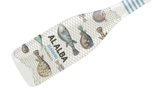 This was an outstanding label on several levels. It included the tactile effect of a fishing net which was produced by applying a clear tactile varnish over the printed image of the net giving a feeling of realism to this sleeve. High quality flexo printing of both the fishes and the net made the design stand out amongst all the group winners. The tactile fishing net allows customers to experience the feel of the net whilst enjoying the white wine. The blue lighthouse adds further interest and also acts as an automatic bottle orientation device in the production application process.
Stratus Packaging, France for Veuve Ambal Crémant de Bourgogne – Mandala
This sleeve looks absolutely stunning on the final bottle which confirms the additional help an illustration of the label in use gives to the judges when submitting an entry. A very fine example of high quality flexo printed in six colours on a white PET base embellished with top quality cold foiling and a finishing varnish. A very neat and tidy result.
Group D Innovation
Joint Winners
schäfer-etiketten GmbH & Co. KG, Germany for Label made from 100% post-consumer recycled PE + wash-off adhesive to allow high-quality recycling
It was the recycling application of this label material which attracted the judges’ attention. Manufactured from 100% post-consumer recycled PE plus a wash-off adhesive reduces the carbon footprint of the label substrate and allows high-quality recycling. This label is digitally printed in four colours plus a varnish but could equally be used for any of the mainstream printing processes.
Kimoha Entrepreneurs FZCO, United Arab Emirates for Examination Label
A novel but simple concept designed to be used under examination conditions where the identity of the candidate is hidden from the marking examiner. The dense black layer is completely opaque which prevents revealing the identity of the candidate until the final marking is completed. Printed using flexography in three colours this label has a very practical use in other security sensitive applications.
Group E Digital Printing
E1 Toner Technology
Joint Winners
Dars91 Dimitar Sabkov, Bulgaria for Deux Plus Limited Edition Cabernet Sauvignon/Merlot
A highly visual label depicting brush strokes in gold. Printed digitally in three colours, a screen varnish was used in the gold areas on top of the gold foiling to add depth. A matt black textured finish was applied to the substrate to contrast with the central gold image.
Etiketten CARINI GmbH, Austria for Amstutz Apfel Edelbrand Barrique
A deceptively simple label with high visual impact. Printed using digital technology in four colours with sculpted hot foil on the apple and varnish on the lettering which gives an embossed effect adding to the attractiveness of the label. The use of a textured paper substrate gives depth in the background of the label. Printed digitally in four colours and a screen varnish.
E2 Ink Jet technology
Skanem Poznan Sp. z o. o., Poland for Kraft Bielice Wódka Kraftowa
Ink jet printed in six colours. The embossing of the hot foil main image adds considerable depth to the label. The highlighting of the factory outline adds a little more interest to the detail. A neat and tidy label.
3 Comments