
Source: https://www.printwellindia.com
By: Dwipal U Patel
Why the Industry Is Shifting
Melamine crockery manufacturers across India are steadily moving from traditional CMYK printing toward a combination of four-colour process and Pantone spot colours. At Shree Printwell Offset Pvt Ltd—a long-established printing press in Ahmedabad known for colour-critical work—this shift has become especially noticeable over the last two years. As more global brands and export clients rely on Indian production, the need for consistent colour reproduction in every batch of crockery has increased significantly. Pantone printing on melamine overlay sheets has therefore become essential not only for accuracy but also for brand reliability.
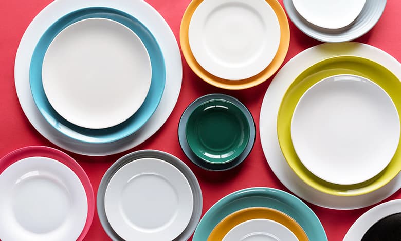
Melamine overlay sheets are extremely light, typically between 43 and 60 gsm, and behave very differently from standard printing papers. Their delicate nature makes maintaining colour uniformity challenging for many offset printers. Small variations in ink density, paper whiteness or drying behaviour can lead to visible inconsistencies once the printed sheets are fused to the final melamine product. With the rising popularity of minimalist designs, clean layouts and solid-colour elements, even the slightest colour difference becomes immediately noticeable. This trend—along with the growth of customised crockery for weddings, corporate kitchens and export markets—has strengthened the demand for Pantone spot inks that deliver predictable and repeatable shades.
Achieving Accurate Pantone Shades on Thin Overlay Paper
Matching Pantone colours for melamine paper is not a straightforward process. Pantone offers different shade guides for coated paper, uncoated paper and textiles because the appearance of colour depends heavily on the surface. In India, most ink manufacturers are used to creating Pantone inks for coated papers—the most common substrate in commercial printing. However, melamine overlay sheets are uncoated and have a whiteness and surface texture that differ from Pantone’s uncoated reference sheets. Directly matching Pantone uncoated shades therefore leads to visible mismatches.
Over the years, Printwell has developed a reliable and practical solution. Instead of selecting colours from the uncoated Pantone book, the team chooses Pantone shades from the coated guide. A manual roll-down sample of the selected shade is created on coated paper and visually matched to the Pantone coated reference. Once the match is confirmed, the same ink formulation is used for printing on melamine overlay sheets. Despite the difference in substrate, this method consistently produces predictable, stable results. Clients are often sent these roll-down samples before production begins to ensure they understand how the chosen colour will appear on their melamine sheets.
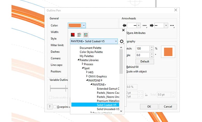
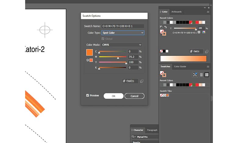
Artwork preparation plays an equally critical role. Designers must work in CMYK mode and apply Pantone inks strictly as spot colours in Illustrator, InDesign or CorelDRAW. Proper bleed settings, controlled ink coverage, flattened transparencies and correct PDF export settings ensure that Pantone spots remain separate and are not accidentally converted to CMYK. By keeping Pantone colours intact, designers give the printer a clear, accurate file that identifies which elements use process colours and which rely on Pantone inks.
For manufacturers developing new melamine product lines or facing colour inconsistencies in their current production, understanding this workflow is essential. Printwell continues to collaborate closely with designers and manufacturing teams, reviewing files, recommending suitable Pantone shades and helping troubleshoot colour-related issues that arise due to substrate behaviour or pre-press setup. As India strengthens its position in the global melamine market, precise colour management—especially through standardised Pantone processes—will be a key factor in delivering reliable, brand-consistent crockery across every production batch.