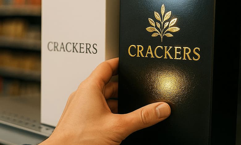
Picture a shopper in a supermarket aisle. Two identical cracker boxes sit side by side — same brand, same flavor. One is plain, the other glimmers with a foil-stamped logo and a subtle UV gloss. Almost everyone reaches for the shiny one. They pick it up, turn it over in their hands, and slip it into their carts without really knowing why.
That simple act reveals a truth marketers have long understood: texture, shine, and weight do more than decorate. They speak to us on a subconscious level. A foil accent or raised varnish doesn’t just look pretty — it signals value, luxury, even trust. This isn’t about vanity; it’s about psychology. Embellishment is print’s hidden language.
Why Touch Changes Everything
Psychologists have shown that even small physical experiences change perception. Holding a warm coffee cup makes people describe strangers as warmer. A heavy clipboard makes job candidates seem more “solid.” These subtle cues show how touch steers our judgments without us realizing it.
When you feel a textured business card, an embossed logo, or the velvety surface of a matte-laminated box, your brain starts to form an attachment. Researchers call this the endowment effect — the moment we touch something, we start to value it more. That’s why retailers put products directly into a customer’s hands: touch equals connection, and connection leads to ownership.
In print, the same applies. A thick, smooth brochure feels more important than a flimsy handout. A package with soft-touch coating lingers in memory. Neuroscientist David Eagleman calls this “the hidden language of print”: texture and weight translate directly into feelings and decisions.
Multi-Sensory Print: Seeing and Feeling at Once
Print has a unique advantage over screens: it can engage multiple senses at the same time. A glossy photograph may catch the eye, but pair it with a sandy, textured coating and suddenly your fingertips are “feeling” the beach. Research shows that when more than one sense is activated, memory and emotional response increase dramatically.
In one lab study, people who read a brochure on heavy, glossy paper remembered the content far better than those who read it on thin stock or on a digital screen. They even trusted the companies on the high-quality paper more. The physicality of print literally made the message stick.
Luxury Brands and the Power of Shine
High-end brands understand this instinctively. Open a premium perfume or smartphone box and you’ll find foil logos, embossed details, and thick, elegant stock. These touches are carefully designed signals: shimmer equals exclusivity, raised textures invite touch, and weight conveys quality.
Our attraction to shine may even be biological. Studies suggest humans are naturally drawn to glossy surfaces because they remind us of water — a primal signal of life and survival. That could explain why a flash of foil feels irresistible.
But context matters. A matte, kraft-textured package communicates “natural” and “wholesome” in the health food aisle, while gloss might suggest “processed” or “artificial.” Embellishments, in other words, are a language — foil, matte, gloss, embossing — and each tells a different story.
Proof in Results: When Finishes Drive Action
These aren’t just psychological curiosities; they influence sales.
A U.S. car wash chain tested postcards with and without foil and raised coating. The embellished version boosted redemption rates by over 30%.
Magazines with foil-stamped covers get passed around more and kept longer.
Business cards with textured finishes are less likely to be thrown away.
Even big brands that tried going “all-digital” have learned the hard way. When Land’s End dropped its print catalog, sales plummeted. Customers missed the ritual of flipping through something tangible. The company quickly revived the catalog — with premium finishes.
Why Print Feels More Trustworthy
In a world of fleeting digital ads, something you can hold automatically feels more credible. Surveys consistently show that consumers view thicker, high-quality print as more reliable and valuable. Embellishments amplify that effect. If a company invests in a glossy finish or foil detail, our brains subconsciously infer that they also invest in quality and stand behind their message.
The Future: Multi-Sensory Storytelling
Today, designers and marketers are combining embellishment with technology to push print further. Imagine scanning a foil-stamped logo with your phone to launch an augmented reality experience. Or pairing textured coatings with scent for a full sensory campaign. The more senses involved, the stronger the emotional connection.
This isn’t nostalgia for paper. It’s strategy. In an era of smooth glass screens, print’s ability to add friction, texture, and weight is its competitive edge. That raised ink under your thumb or that shimmer in the light tells you: this matters.
Key Takeaways
Attention: Foil and gloss grab the eye in crowded spaces.
Emotion: Texture sparks subconscious pleasure and attachment.
Memory: Multi-sensory print is better remembered than flat visuals.
Trust: Heavier, embellished print feels credible and premium.
Action: Enhanced finishes measurably increase sales and response rates.
Final Word
The real magic of embellishment isn’t the sparkle itself. It’s what the sparkle makes us feel — that this product, this message, has substance and significance. At a time when most communication disappears with a swipe, the tactile weight of embellished print reminds us that some things are worth holding onto.