Brand Heidelberg To Get A Make Over
Heidelberg has been undergoing strategic changes in the recent times. In lieu with these developments, the company is introducing a new brand identity which will be in line with its strategic orientation. The new logo will feature unique, color-coded identity for each of company’s core areas going forward – services, equipment and consumables. The new Heidelberg branding will be introduced and implemented worldwide by the time of drupa 2016.
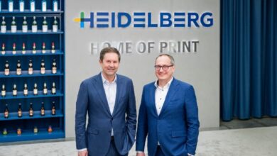
Heidelberg has been evolving with the market and it has systematically adapted its portfolio to today’s and tomorrow’s customer needs and requirements. Heidelberg CEO Gerold Linzbach stated that the printing equipment manufacturer is now ‘fit for the future’. He said, ‘The reorientation will enable Heidelberg to enjoy sustained profitable growth in the future.’
Heidelberg intends to focus more on customer benefits and this new brand identity will help achieve this motto. The new brand identity reinforces the customer benefits that Heidelberg is offering through its all-inclusive portfolio of digital and offset printing, workflows, consumables and services.
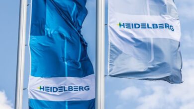
Service, equipment and consumables are the three pillars on which Heidelberg’s portfolio is based and each of these pillars is being given its own color-coded identity in the rebrand, with yellow for services, blue for equipment and green for consumables. These colors are also used in the initial letter of the redesigned company logo.
Though the new logo incorporates new colors, it has still maintained its traditional blue color which as per the company is ‘a symbol of the company’s competence, its unique global network and all its staff’. The first letter of Heidelberg will also be used as a brand icon alongside the new logo.


